Not accurate. It really depends on your device and connection.
For me, TradingView loads in under 1 second for any chart with layout and drawings. Never faced any slowness with them, expect in late 2023.
Not accurate. It really depends on your device and connection.
For me, TradingView loads in under 1 second for any chart with layout and drawings. Never faced any slowness with them, expect in late 2023.
Absolutely right. But I humbly beg to differ on-
It took decades for TV to be at this level with concentrated area of operation. On the other hand, for broking business, expecting to set up a DEV team to work on just charting solution could be little unjustified at their end. No doubt many beokers have started doing it but I guess it’s too outsourced and/or forked. Reason - all other chartings resemble ChartIQ. Uniqueness of TV is nowhere seen with those charts.
This is what I feel. I may be wrong.
Maybe. But I have similar feedback as mine from the persons using TV premium.
Hi @RahulDeshpande,
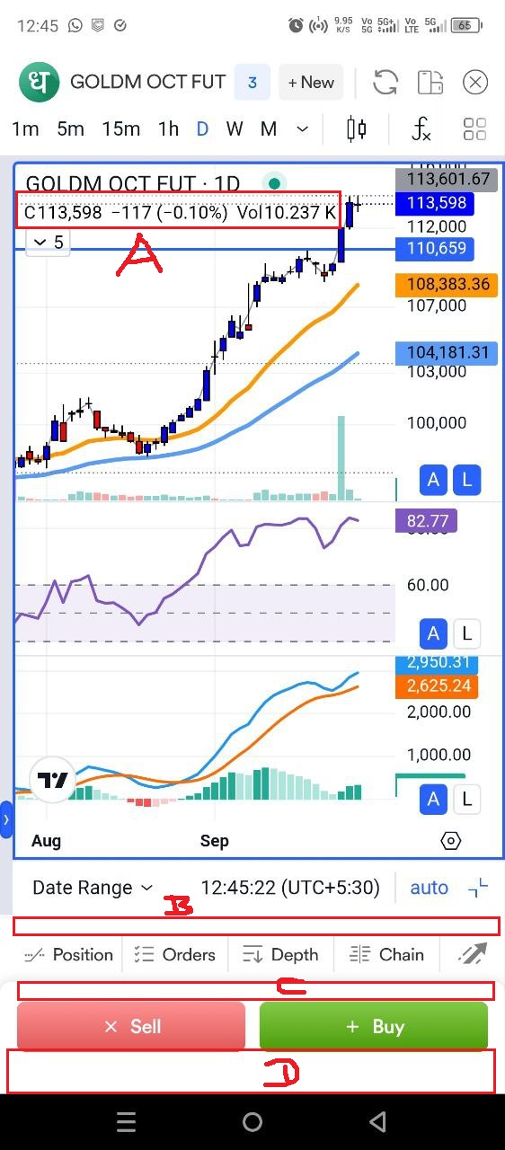
Here is some feedback on the recently updated Dhan app. Look at the image below:
Refer the “A” marker: Earlier this used to show OHLC along with change and change percentage. With the recent percentage, it has gone. This is a key data that a trader needs. I feel this is a wrong to remove this functionality.
“B, C, D” markers: As traders, trading on the basis of charts, we need the maximum screen space to be utilised for chart area so that it can show maximum possible data. But these markers along with rectangles indicate wasted screen space. Please check if this can be optimised.
Wow, never noticed this. Yes would be great if these spaces could be minimised or eliminated, which would leave more space for charts.
Good suggestion @Shally buddy!
This can only be fruitful only if acknowledged by team.
@Shally seems the A and B are only there in the Android version. The IOS app doesn’t have these issues. Strangely, both are on the same version.
IOS version: v1.0.086 e1.0.0
Android version: v1.0.086 e1.0.0
Hack for A: Change to horizontal mode ![]()
@nitishbangera, given the mobile screen’s aspect ratio, the horizontal mode flattens the charts too much. The visual appeal is lost. Thus, as a personal preference, I use vertical mode almost all the time.
@Shally I understand. It was mentioned in jest ![]()
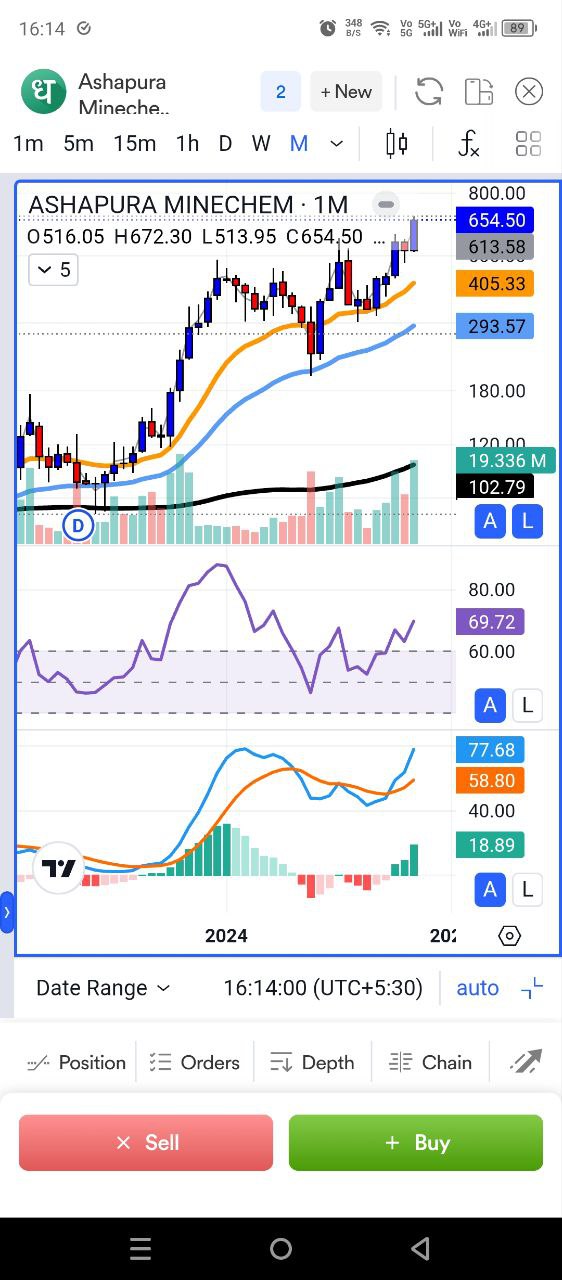
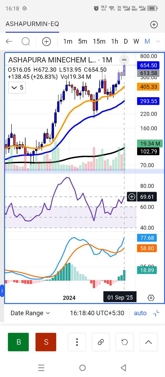
Just to point out, see the cleaner interface and better use of screen space to show bigger chart data.
I feel UI has much scope of improvement here.
Also, notice the showing of OHLC, change, change % and volume.
Even I feel overall app UI is cluttered and the same time kidish. Again, it’s personal preferences but overall feel isn’t elegant.