I am an active user of your platform. I have also successfully onboarded three additional accounts for my friends and family. While I appreciate the vision of the app, there are several significant UI/UX “friction points” that are currently impacting our user confidence and overall experience.
I would like to highlight the following areas for improvement:
-
General UI Clarity: Both the App and Web interfaces feel cluttered and non-intuitive for new users. Unlike competing platforms, my family members frequently find themselves lost in the navigation, requiring constant assistance to perform basic tasks. A more streamlined, minimalist design would greatly benefit user retention.
-
Mutual Fund Comparison Toggle: In the Mutual Funds section, the performance chart defaults to a comparison against the benchmark index. Having to manually disable this comparison every single time I view a fund is repetitive and frustrating. I suggest adding a “Default View” setting that allows users to choose whether they want the benchmark comparison on or off by default.
-
Navigation Enhancements (Tab Swiping): When analyzing a specific fund, navigating between “Holdings,” “Outperformers,” and other data tabs currently requires precise tapping at the top of the screen. On modern, larger mobile devices, this is ergonomically difficult. Implementing horizontal swiping gestures to switch between these tabs would significantly improve one-handed usability.
-
Data Accuracy (NAV vs. Displayed Returns): I have noticed discrepancies between the returns displayed on the app screen and the actual NAV performance. For example, in the Nippon India Taiwan Equity Fund, the figures do not seem to align. Consistent and accurate data is critical for maintaining investor trust.
NAV on 9th April 2025 is - 8.0026
NAV on 8th April 2026 is - 28.8216
In app it is showing 235.44% return over a period of one year, but if you really calculate it
28.8216-8.0026 = 20.819
20.819/8.0026×100 = 260.15% returns -
Stale Portfolio Holdings (3-Month Lag) As of today, April 10, 2026, the fund holdings on your platform are still reflecting data from January 31, 2026. In a volatile market, a three-month lag in portfolio visibility is unacceptable for an “investment-first” platform. Most competitors update holdings within 15–20 days of the month-end. Being stuck in January while in April suggests a failure in your automated data fetch systems.
-
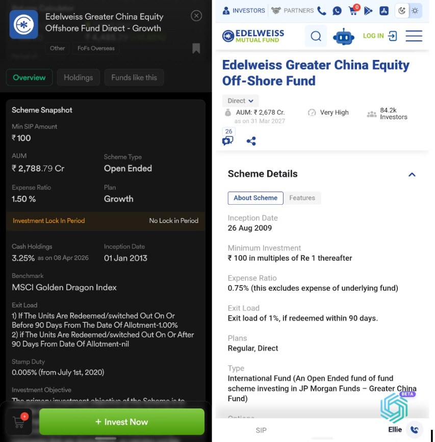
Incorrect Total Expense Ratio (TER) Reporting There is a massive discrepancy in the Expense Ratios shown on Dhan compared to the official AMC data. Example: your app is displaying an Expense Ratio of 1.5%, whereas the official AMC website and other tracking platforms show 0.75%. This is not just a “clutter” issue; this is incorrect financial information. It could lead a user to reject a good fund based on a falsely reported high cost.
I have moved significant capital to Dhan because I value the platform’s vision, but these fundamental data inconsistencies make it difficult to manage my portfolio effectively. Reliable, up-to-date information is essential for my investment strategy. Without it, I will have to reconsider my future contributions and may need to explore other platforms that offer more timely data accuracy for my existing holdings.
Look on the bright side: if these data issues aren’t fixed, your support team is about to get a lot more free time!
Since I’ll be forced to move my capital—and take my friends and family’s accounts along with me—you’ll have much fewer ‘clutter’ complaints to deal with. Consider this my gift to your work-life balance!
Cheers