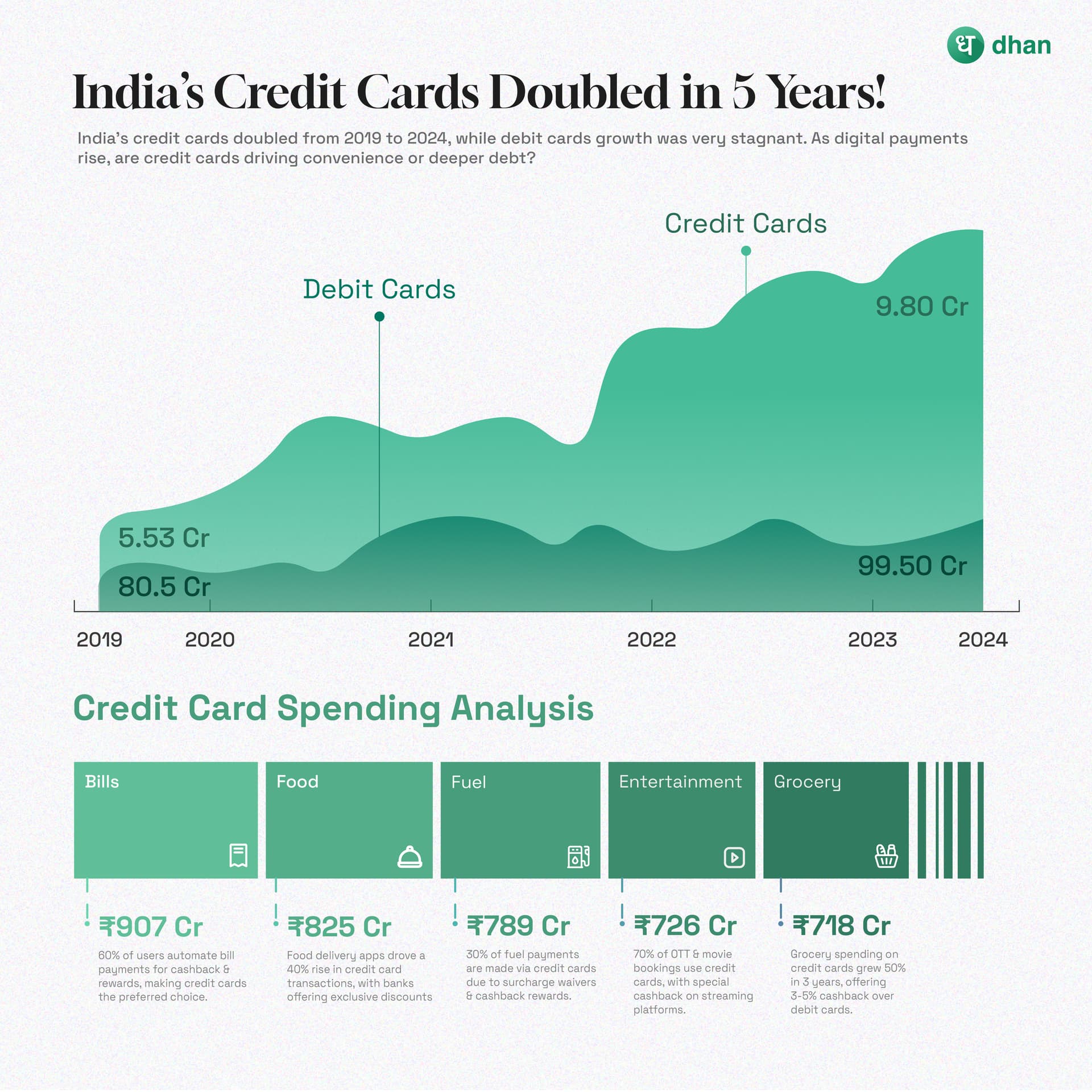
Number Of Credit Cards More Than Doubled In 5 Years
According to an RBI report, the number of credit cards has more than doubled to 10.80 crore by December 2024, compared to 5.53 crore in December 2019. In contrast, debit cards saw only a marginal rise from 80.53 crore to 99.09 crore during the same period.
This trend is reflected in transactions as well. In CY2024, credit cards accounted for 447.23 crore transactions worth ₹20.37 lakh crore, while debit cards saw 173.90 crore transactions worth ₹5.16 lakh crore. The report highlights a 15% YoY growth in credit card usage, while debit card usage has declined.
Hard to take this post seriously due to the several inconsistencies. @RahulDeshpande Please fix.
Inconsistency in the numbers in the text vs. the graphics.
Is it 10.8Cr or 9.8 Cr? Is it 99.09 Cr or 99.50 Cr?
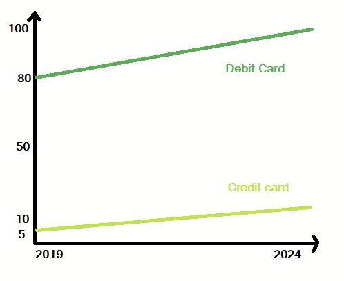
The chart commits the cardinal sin or using 2 different scales for the 2 values being plotted.
The Y-Axis scale for Credit-card plot and the Debt-Card plot are vastly different.
The Y-axis doesn’t start at zero, further distorting the visual from the reality.
An alternate way to describe the same is -
During this 5-year period,
just the delta-increase in the debit-cards is nearly double than the total credit-cards out there.
Unable to correlate the numbers
in the break-up of the horizontal bar-chart at the bottom
with any of the numbers mentioned in the text or the graph.
Visually, roughly 90% of something credit-card is equal to (907+825+789+726+718) = 3225 CR.
What is this 3225 Cr though?
Transaction value? No. of users? No. of transactions? Delta-change in any of these values over time? Something else?
Please provide links to the source data/ source article(s).
In these InfoGraphic posts,
please focus on informing the reader and not on graphics,
and definitely not on pushing a narrative that one has in mind.
For folks creating such infographics,
the book How to Lie with Statistics by Darell Huff
is probably a good start to avoid the common pitfalls.
Thanks for your detailed feedback on the infographic—it’s valuable and will help us improve future designs.
You’ve raised valid points, and we completely understand the concern. However, given the constraints of a 1:1 image format, we sometimes take creative liberties to ensure clarity and readability. In certain cases, starting the Y-axis at zero while maintaining all necessary details isn’t always feasible.
That said, we absolutely recognize the scope for improvement and creativity, and we strive to incorporate all constructive suggestions. We truly appreciate your input and will keep your feedback in mind for future designs.