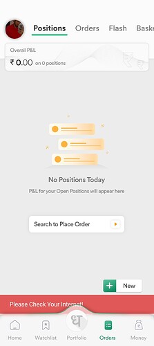
Dhan Mobile App:
-
Fonts are too small and its very painful and boring to look at, search and read to comprehend the necessary information about our positions or portfolio that we need to know more frequently. Even if the overall layout is fancy, colourful and apparently attractive it becomes too tiring and boring to search for the requisite information that we need due to excessive number of informational objects being displayed on every page of the mobile app.
-
Due small sizes of the fonts, tabs and the check boxes or the rows and columns it becomes difficult to select or deselect any checkbox or row on the small screen of mobile. All the buttons also appear too small. Accidentally we end up selecting wrong check box or wrong row and then again, we have to go back to select the correct option.
Its a request to please at least increase the size of the fonts to make it easy and pleasant to read and increase the size of the rows and the corresponding check boxes to make it easy to select or deselect accurately.
For the old people and specially for people with spectacles it becomes a herculean task to go through each and every informational object that is displayed on the mobile app with tiny fonts in a small screen of the mobile device and then try to execute some actions or functions by selecting the tiny buttons and boxes. -
Try to keep the mobile app little simple and minimalistic with only the relevant and necessary objects of information and buttons of execution for investing and trading. Rest everything can be accessed on the website or the web portal.
If Dhan team does not want to reduce the informational and executional objects then you can increase the pages and tabs inside the app but at least please improve the size of the font and buttons. There is no need to cramp maximum number of objects on a single page or tab with tiny buttons and miniature fonts.
This app can appear very user friendly and attractive for tablet users but for smaller screens of mobiles it is really a painful experience.
When I was using other brokers platforms like Upstox or Fyers, I was very much comfortable with using their Mobile apps as well. However, with Dhan the mobile app is so much cluttered with so many info objects that too with such small tiny fonts and tiny buttons that I feel extremely reluctant to even open the mobile app unless sometimes when I do not have access to the Web platform and compelled to seek information from the mobile app.
