Dhan ui improvements

Hello ,
I am trading for more then 1 year with dhan, And i love the execution speed, affordability, and low charges. But there is still a lot of room to improve.


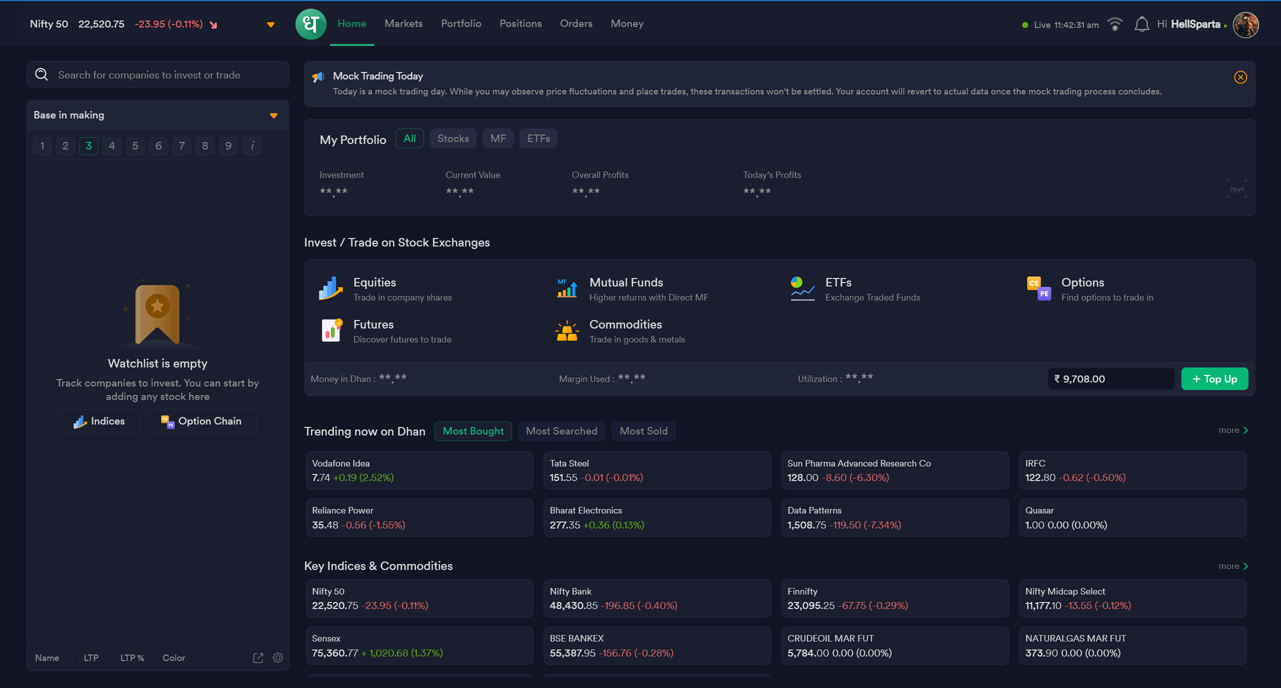
As you can see how much clutter on the “HOMEPAGE” of dhan. And trust me this bothers me a lot when trading real time so many numbers moving, mutual funds commodities futuers etc.


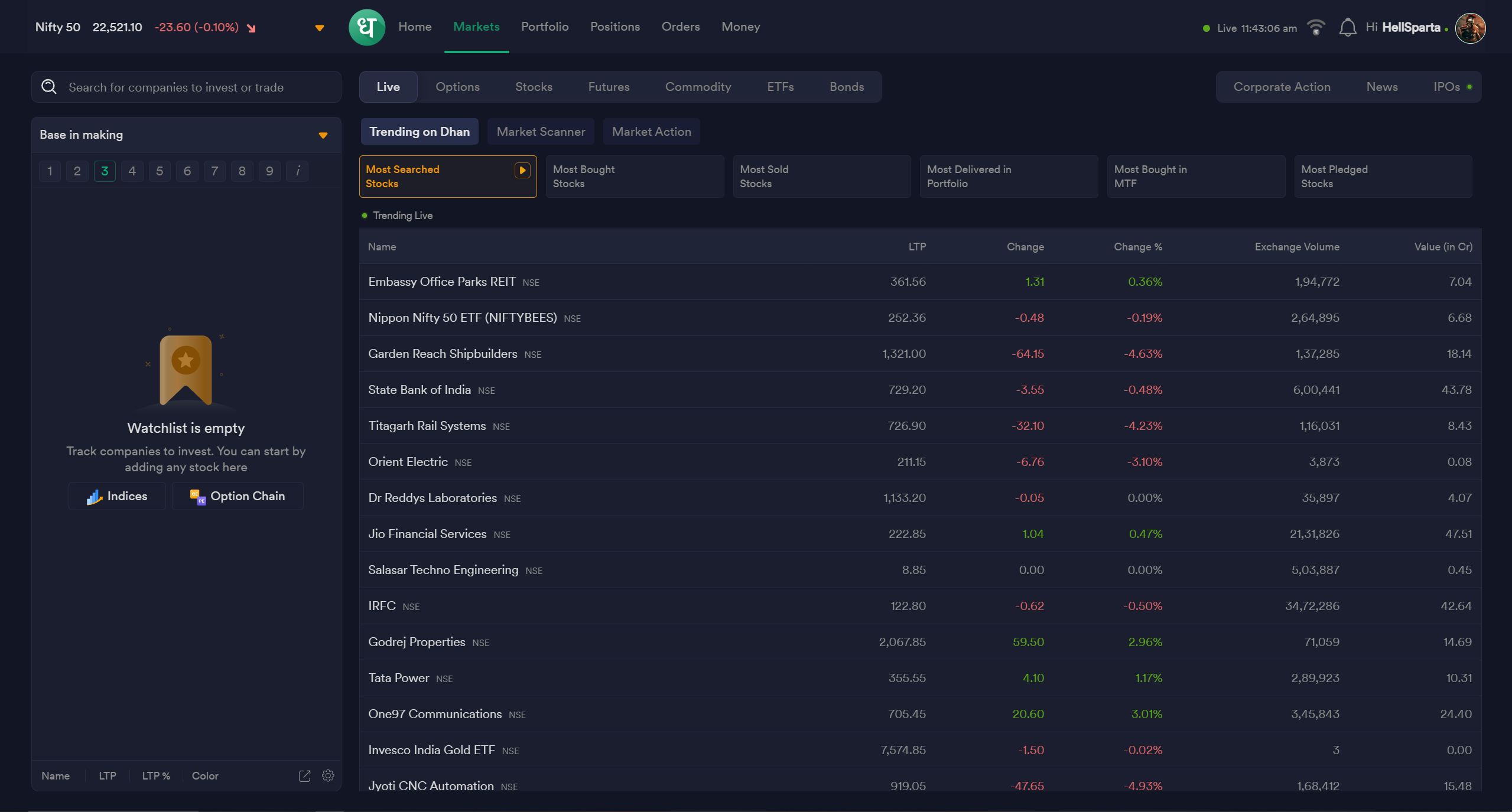
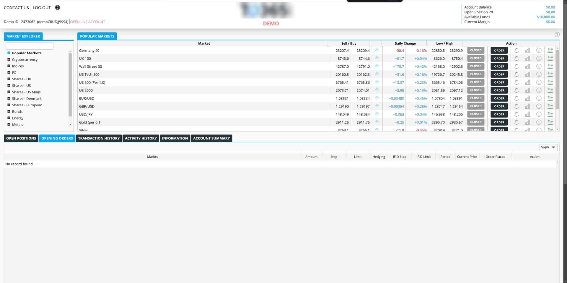
To be honest ( i might be wrong) this market tab does not make single sense to me, its not just “This is most trending stocks”, Its bombarded OPTIONS, STOCKS, FUTURES, ETFS, COMMODITY, BONDS with Most bought, Most sold, Most delivered, Most bought in MTF, Most pledge stocks. i mean whats the point of all this? and rite next to it you giving the option “MARKET SCANNER” like seriously? you guys made seperate scanner “SCANX” why just thorwing everything in dhan terminal?


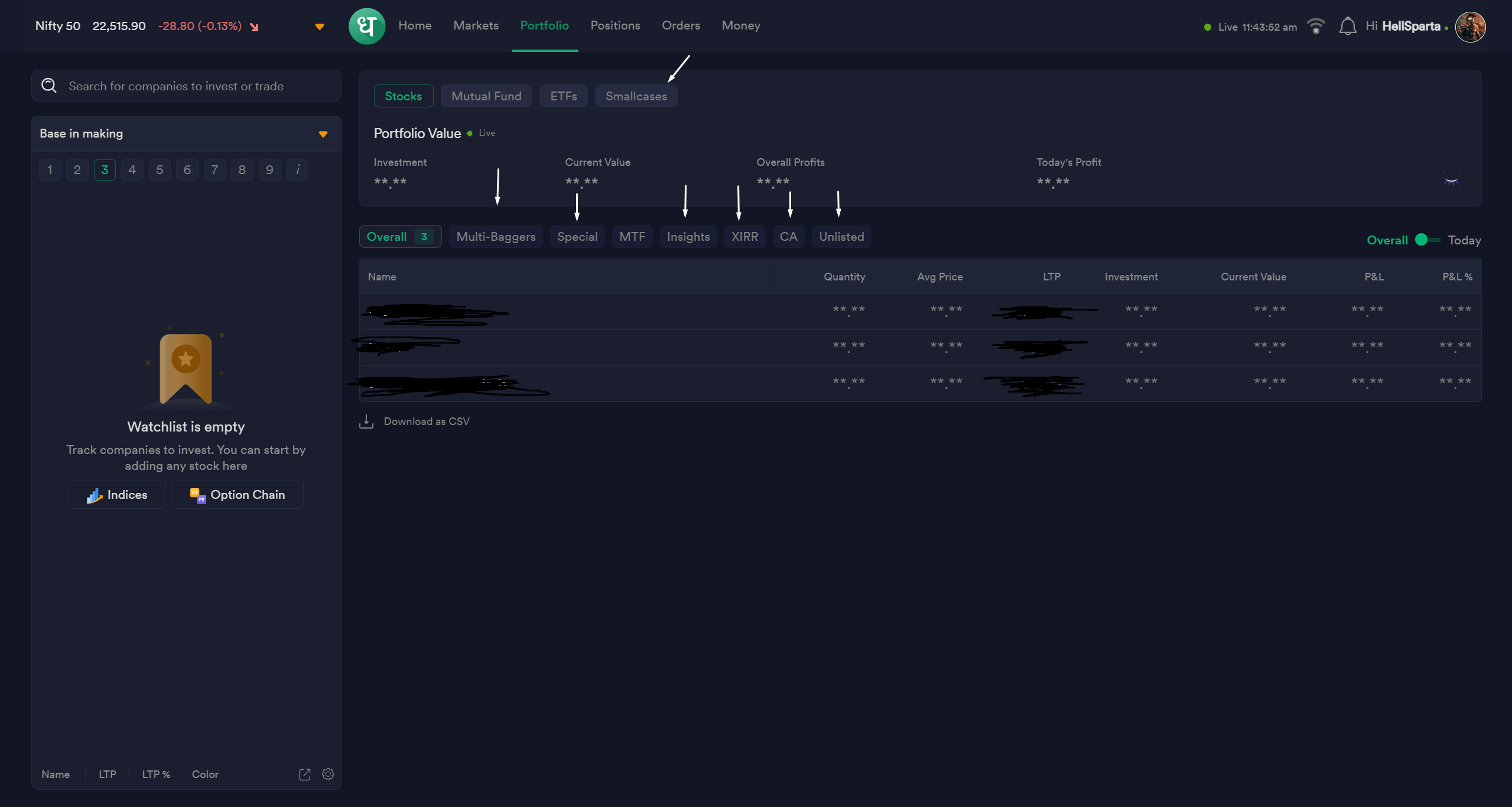
ON portfolio section a investor/trader just want a look to his portfolio, these options are so unnecessary to me “Multibagger” “Special”? why? there is watchlist for it? i mean for the same feature you made unnecessary extra options.

4


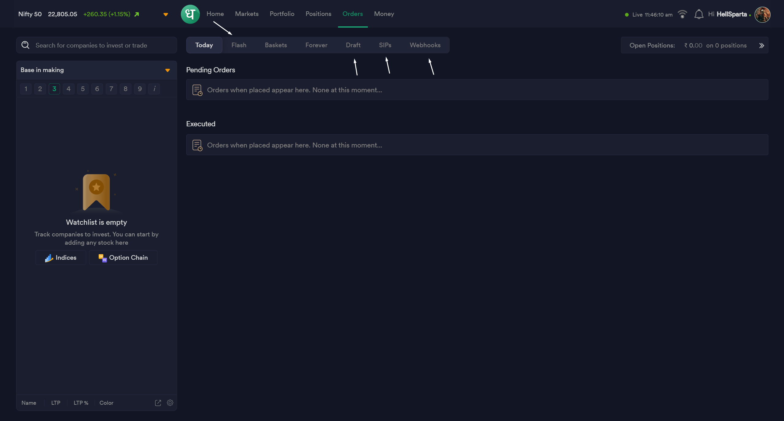
i mean look at this when a trader is trading which is most basic on trading platform, the order tab is so messed up, when i want to place fast order. i just lost in tabs where the heck is today tab.

Summary:- See these feature are good for new traders complicated things overfilled/bombarded with unnecessary features these things attract new players, but if you want long term players you should clean your UI for the most basic things like order window, clean the homepage, clean portfolio view, thats it we do not need much on trading platform UI, the less it is the good it is, i dont want you to mess up your UI if you do not want to i want you to atleast expirement launch “LITE DHAN” or something like this with just basic features Zerodha like UI, you guys got really good plus points like instant margin, lowest MTF rate in industry, highest fast withdrawls, Fast execution, the only things that bothers me is you BOMBARDED UI. please fix this its my humble request i really want dhan to grow a lot you guys doing so much for “RETAIL TRADERS”

If anything sounds bad, i appologize for that, i just gave my feedback.
Keep growing, God bless.

6 Likes

This is something that I agree with. Dhan homepage is not desirable the way it is right now.

From very light non-uniform fonts to placement of the buttons to the navigation. All needs a complete overhaul. To this day Dhan web is a maze.

I hope things can be made sleek and the Dhan web could be worked upon to give a terminal like functionality similar to AngelOne’s TradeOne mode. They have outdone everybody on that widgety page. Sleek, responsive, functional, looks good, and good choice of fonts.

Fonts needs some boldness and some professional feel. Not the cartoonish type it is right now.

2 Likes

I totally agree with you :slightly_smiling_face: @PravinJ

1 Like

@Sandeep

I just came to Dhan to post about the UI improvements and saw your post already rocking on home page.

There are lot of things running on home page at the same time. And as a professional, you really do not need much information to trade. You just need faster execution, and minimal UI where you can easily see your favourite scripts and open positions with SL numbers.

Something like this. No distractions. I don’t want to mention the platform name. I am not sure if I can mention.

Dhan should give option to switch to minimal if they want to keep this much information on home screen.

2 Likes

Creating a poll here. Let’s see the results of the poll. Do you think Dhan web should get a makeover?

@YashM @BIR @Sandeep @Pradumya @Brishide @t7support @Shally @Dhanush4777 @Duck @Subhajitpanja

4 Likes

Voted sir @thisisbanerjee

2 Likes

Change For Good Is Always Welcome

2 Likes

Voted sir :saluting_face: for better ui

2 Likes

@Sandeep kept very good view.
@thisisbanerjee thanks for tagging me
I am primarily a Frontend UI Developer by profession. From my professional perspective, I believe it depends on the client, as requirements vary from one client to another. When there are multiple features, some may find certain features useful, while others may see them as unnecessary or overwhelming. Some people may prefer additional new features alongside existing ones, while others might feel that certain features are not needed.

One possible solution is that @Dhan can create a customizable menu (feature) section under settings, where all features are displayed with checkboxes. This would allow users to customize and select/unselect the menu features according to their preferences.

A similar approach can be seen on the Screener.in website.

@Hardik @RahulDeshpande @PravinJ

1 Like

I agree with you @Sandeep, they can provide these features in a simplified manner
I am a full stack web developer.

Take example of international platform like Binance app
They also provide lot of features in a simplified way
Example of good UI/UX.

1 Like

Binance has by far the best ui in the industry

2 Likes

Make the UI so simple that even a 50-year-old non-tech-savvy user can use Dhan with ease. Currently, almost everything required for investing is available on Dhan — 99.5% features are already in place, except for the Event section on the stock page and Forever order on the order page. Now it’s time to just reorganize things for a cleaner, more intuitive layout with all tabs in one place.

When a stock is opened via search, it shows different tabs , but when it opened from the portfolio, the tab arrangement changes — while this may be technically understandable, it can easily confuse an older user. Rearrange and simplify Dhan to become everyone’s first choice for investing.
Wishing the team all the best for the future!

1 Like

One relatable example could be bank’s netbanking dashboard. Some banks provide customised dashboard where we can decide what to have on screen and at which position.

2 Likes

Done!

1 Like

88.9% unique votes say Dhan Web needs a rethink, out of 36 votes. Still live and counting.

Dhan team needs this data since they say all decisions they take are driven from user feedback.

2 Likes

My question is why no one from dhan is replying on this topic ? I think they are thinking is this one is not important at all other wise they will consider our reply on this topic

2 Likes

Thank you guys for support on this thread, if you guys really want a change, hope we get enough people, so dhan might consider these changes, lets hope for the best.

@thisisbanerjee

Personally I don’t think it needs to be changed. Some people like minimalist UI…some like the all in one place UI. Besides as a trader I prefer to get the core trading experience fixed at Dhan - margin update delay, margin update glitches, multiple order type failures due to margin update delay, features with bugs etc

4 Likes

Not changing but making the elements professional and beautiful. It looks heavy on the eyes to me atleast and works a bit slow. Navigation needs to be simplified and these can be done keeping the current design intact.

What I am asking for is - BEAUTIFY and SIMPLIFY. That would help you too. :slight_smile:

1 Like

Personally I think functional part should get more priority than UI enhancement one.

If my trading stuck due to any glitch. What is the purpose of UI

Both are important but functional part should come 1st

2 Likes