Dear Dhan Team @Bhavya_Jain ,
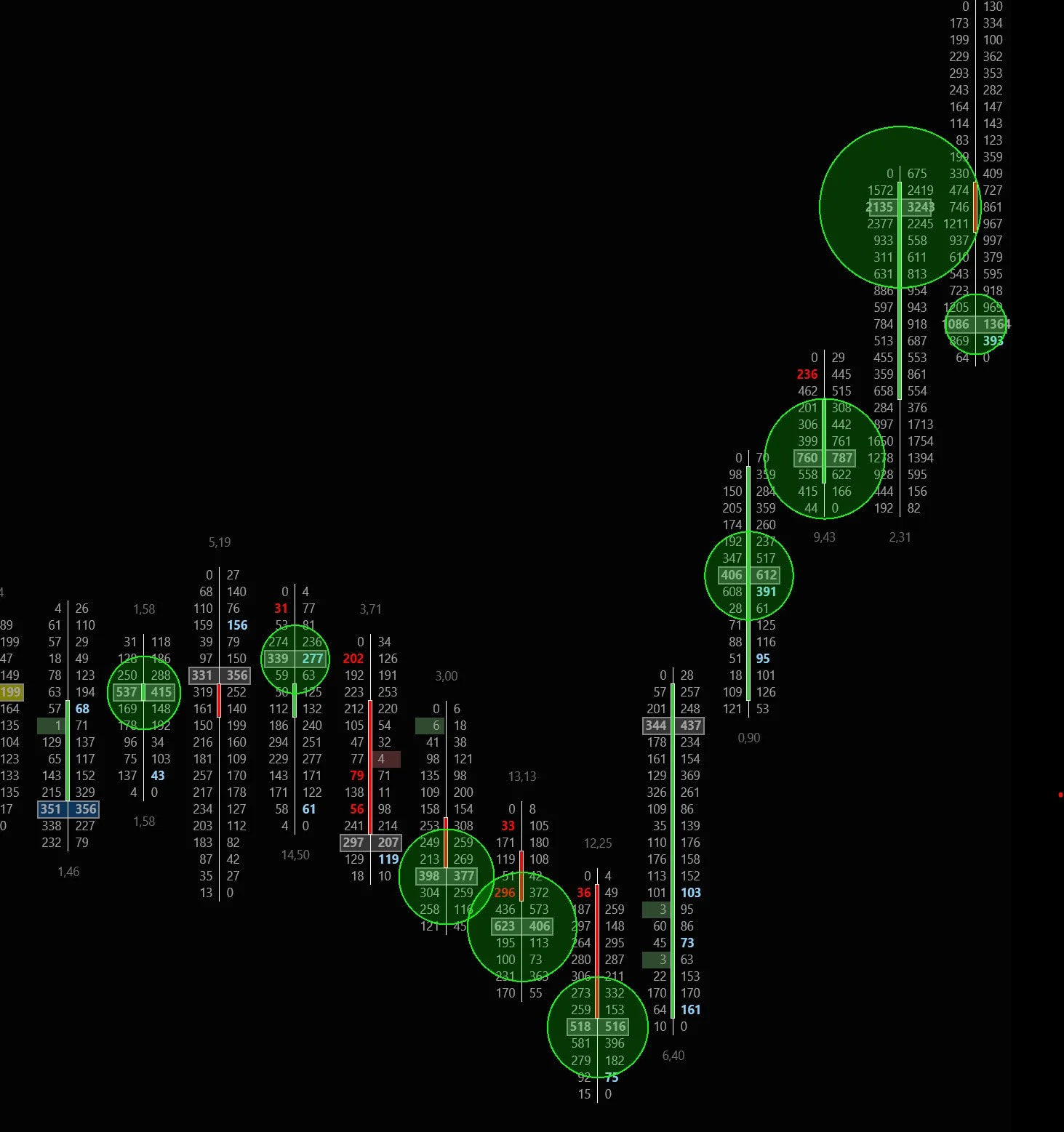
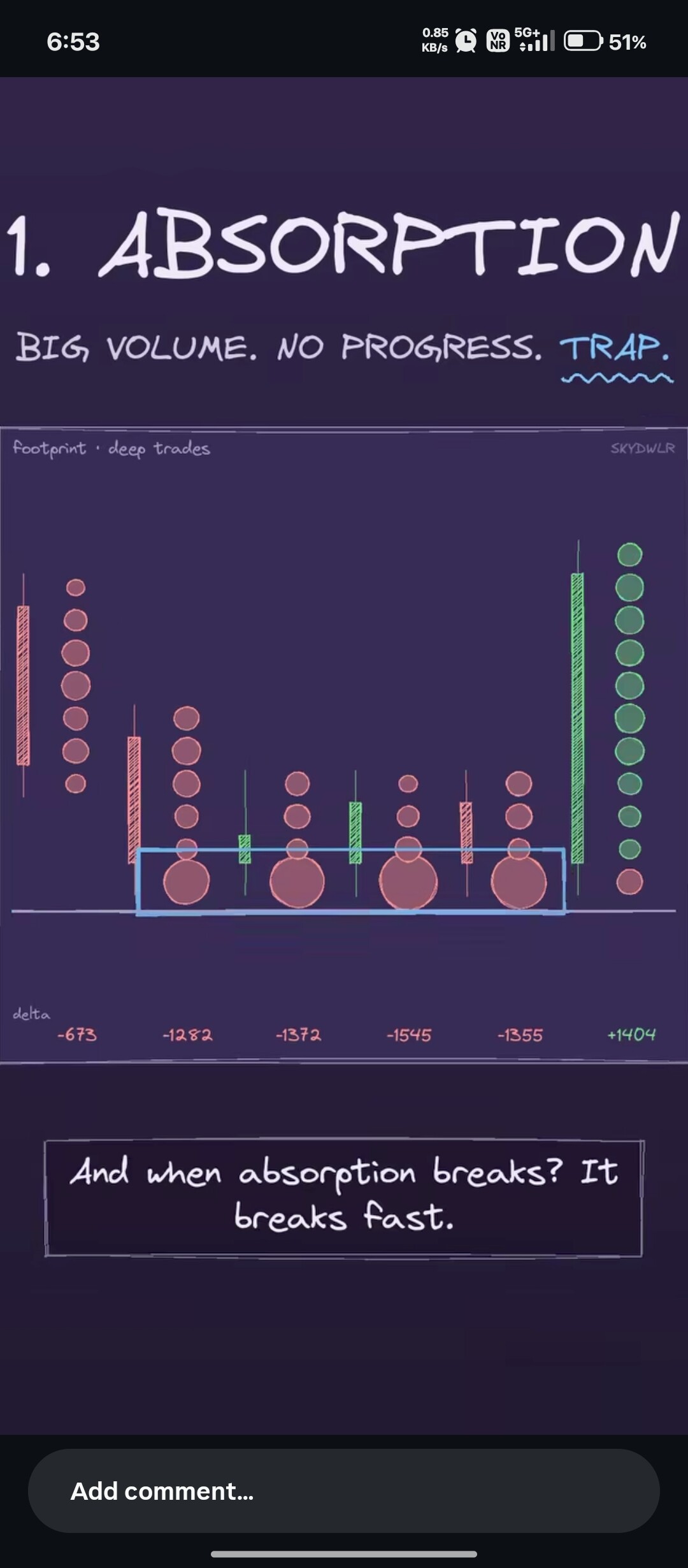
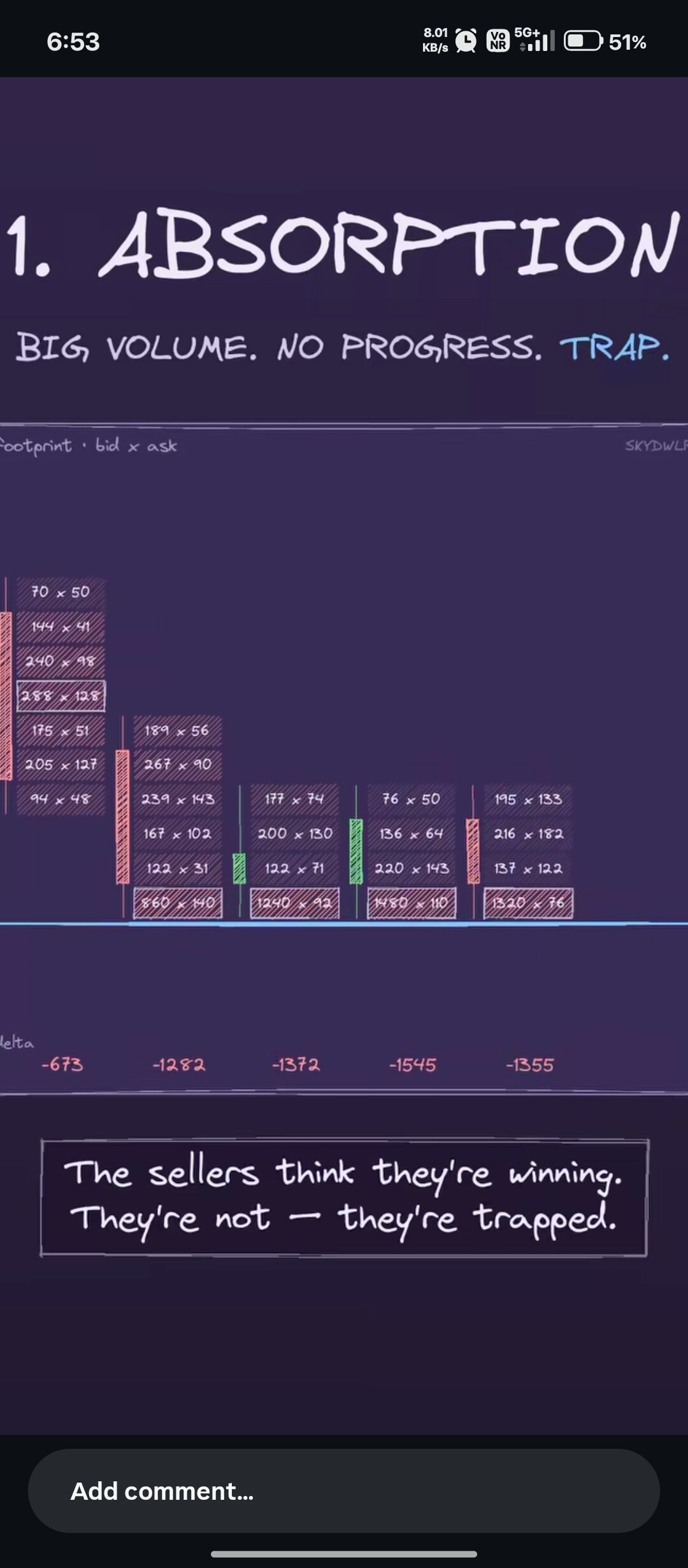
You already have the live Time & Sales tool running on the platform. I want to ask your team to simply take that existing data stream and print it directly onto the live charts as visual circles (bubbles).
Here is the exact simple logic you need to add to the chart:
• 1. Quantity Filter: The user types a number (like 10,000). The chart automatically hides all small retail noise and only looks for big trades of 10,000 or more.
• 2. Live Time-Wise Printing: The exact millisecond a trade hits the exchange tape, the bubble must print instantly at that exact time right inside the moving chart candle at the exact price.
• 3. Adjustable Bubble Size:
• Auto-Scaling: A trade of 50,000 automatically prints much bigger than a trade of 10,000.

• Size Adjuster Setting: Add a simple size multiplier slider (like 1x, 2x, 3x) in the settings so traders can adjust how big or small the bubbles look on their screens.
• 4. Simple Colors: Green bubbles for big buy trades, red bubbles for big sell trades.
Conclusion:
Your team does not need to build a new data engine. The Time & Sales data is already there! Please just create a simple visual layout option that prints those exact numbers as live bubbles on our charts.
Best regards,
Rajmani gupta