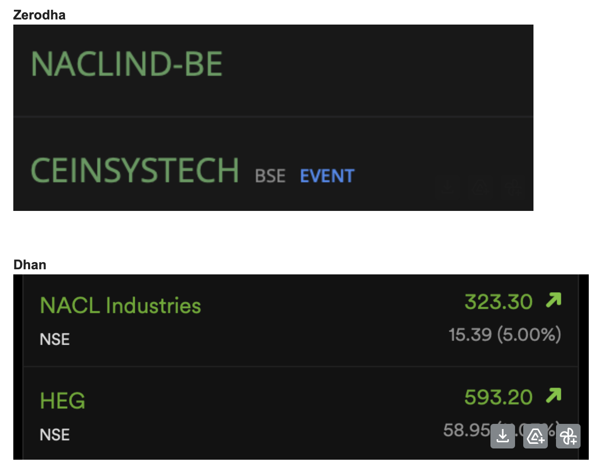
I use dark mode everywhere. The mobile app and dhan web don’t have a professional color scheme. Particularly disturbing is the bright, glaring and cheap green color which Dhan uses.
The sober green used by Zerodha (in the watchlist for example), vs. the gaudy and eye torturing bright green used by Dhan. Mac is color perfect, so please don’t blame my system.
Zerodha is way behind on technology and features compared to Dhan, but Dhan is definitely behind Zerodha when it comes to aesthetics. I really hope you can at least tone down the green color a little bit, it is the most disturbing.
I have uploaded a screenshot for reference. It appears much better in the screenshot, but the actual color seen on the website in my MacOS Safari browser is horrible.
Thanks.
I beg to differ, Dhan’s colours are pretty good and aesthetic. Z’s one looks like a brain-dead terminal and your capital will anyways go to Zero over there. They literally take customers for a ride by their obsolete tech and lazy design team and people think that is a feature.
Yes, but on design terms Dhan web is not that good TBH. Not on colours. There’s a difference.
@Conrad_Ray
Hello @Conrad_Ray,
As discussed on call, thanks for the feedback. We understand that colour preferences vary, and we’re always working to improve the user experience. Your input is valuable, and we’ll definitely consider it moving forward.
You are right about zero barrier (rodha) for your capital going to zero with Zerodha. Today my instant payout failed and they blamed me and my bank and closed the ticket 
But the web.dhan green is a bit too bright, regardless the theme is carbon black, light or royal blue.