Hello,
While Dhan has improved a lot on the execution and reliability front, the UI part remains unfocused and cluttered.
Specifically, there are 3 concerns that needs to be addressed:
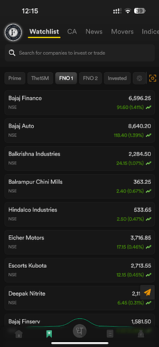
(1) Spacing between stocks on the watchlist is a major attention drain and screen space drain. I prefer a watchlist with a clean look without any bulky spacing in between stocks.
(2) Navigation is the same as it was 2 years ago at launch, still cluttered. Please please improve on the navigation front and the landing screen.
(3) Fonts appear a tad small on iOS, would have preferred 1 size bigger. It strains the eye.
Attaching the watchlist pic.
