Hello!
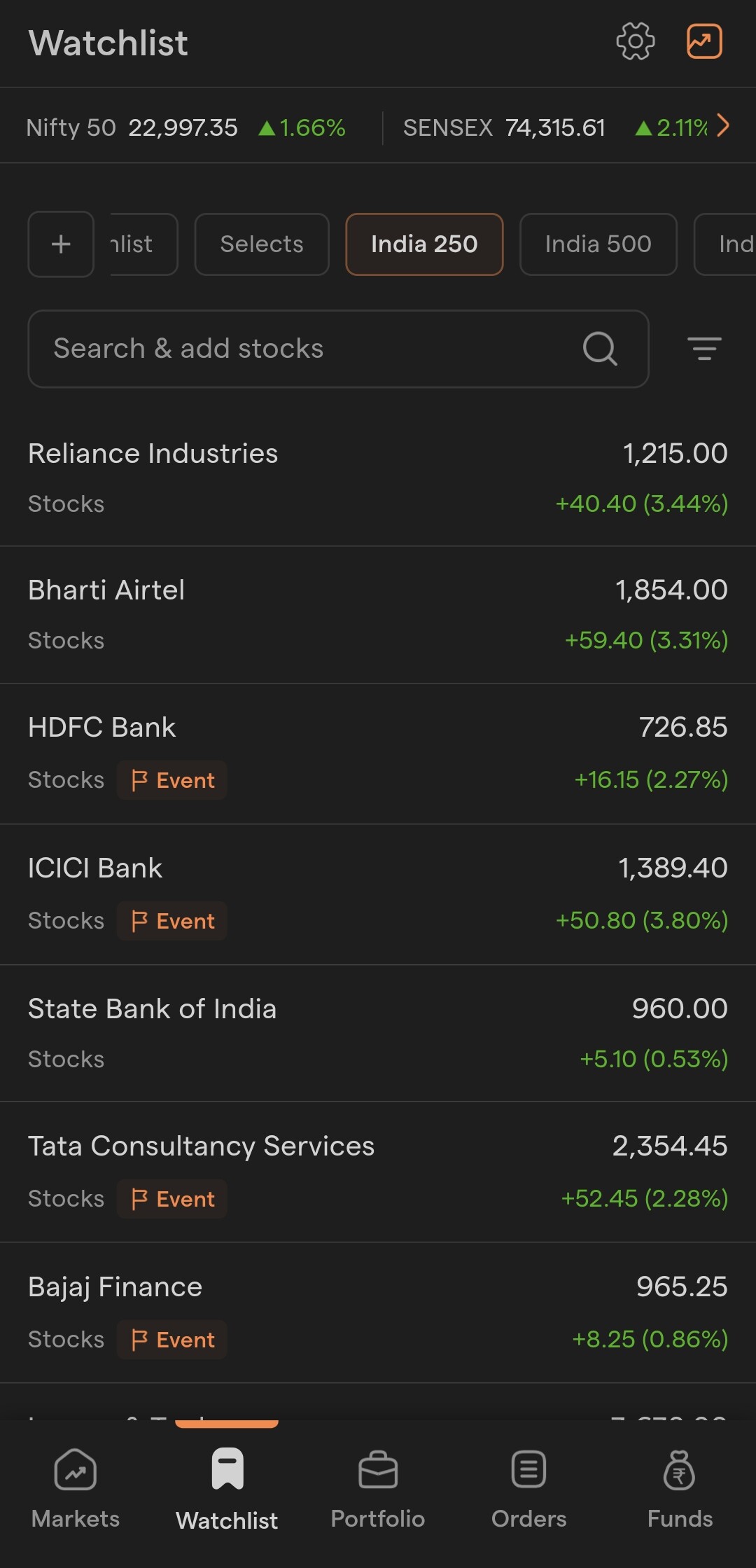
The watchlist interface in the Millions app is really clean and intuitive, especially without the card-style layout and unnecessary spacing between items, which I find less appealing in the main Dhan app.
Requesting the team to consider adopting a similar compact, streamlined watchlist design in the Dhan app for a cleaner and more efficient user experience.