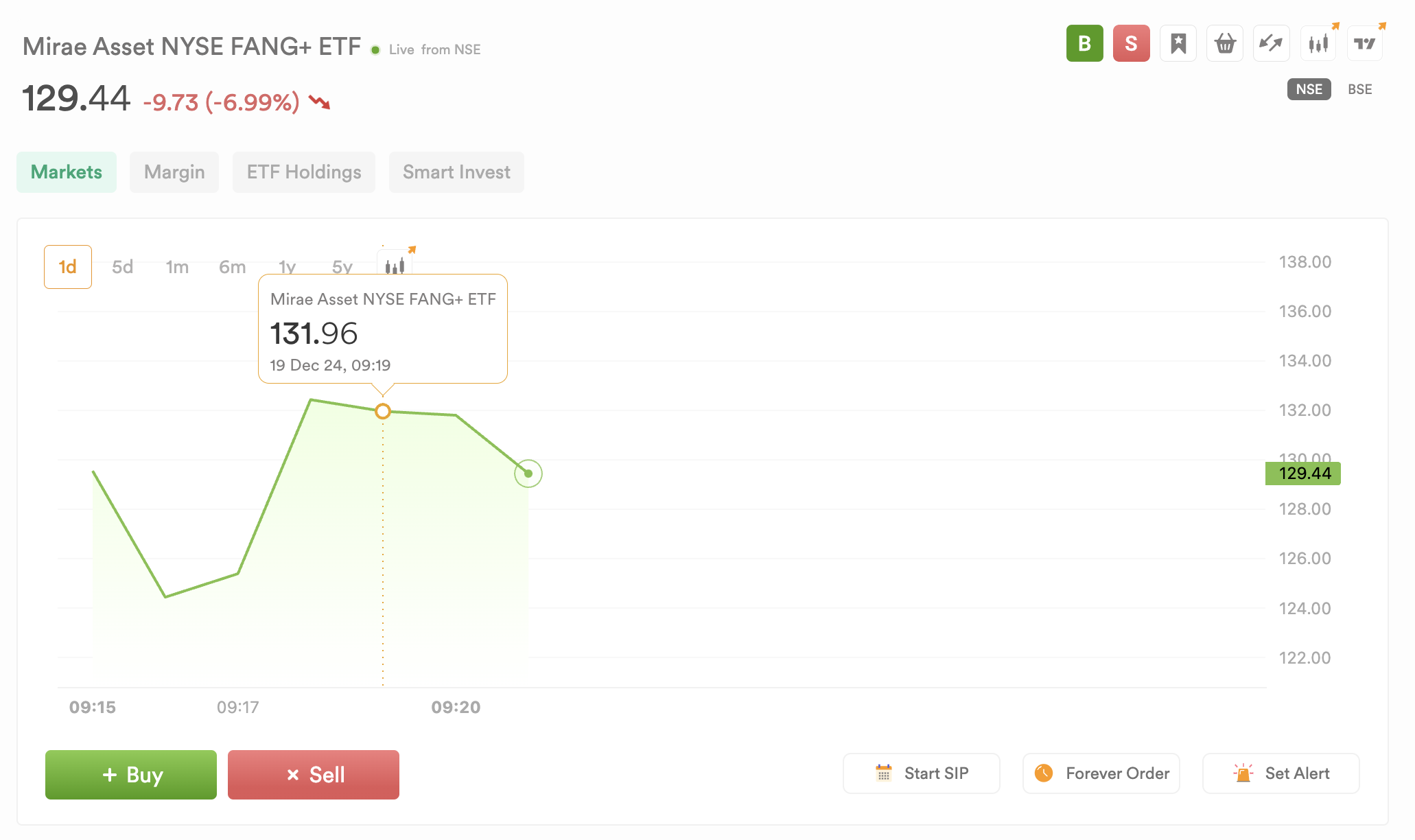
What do you see here? The price is down 6%, indicating a negative trend, yet the chart remains green. This may be due to us starting the chart with the closing candle at 9:15. Few brokers display charts this way. Please correct it.
@PravinJ
Hi @priyanka_gupta The chart that you are seeing is on a daily timeframe, so it will show the price from the day’s opening till now.
If you change it to 5Day or other timeframe, it will show and capture the trend of y’day.
We are good with this approach and have kept it that way for past 3 years. Change product or approach just to capture insight for that one day isn’t something we would do, if someone starts looking at y’day data at the charts - the outlook for stocks + thesis for trading will change completely and may lead to misinformed decisions. Hope this clarifies.
Thank you for your response. I’ve identified the issue. At 9:15 AM, Dhan is plotting only the close price of the 1-minute candle. This means it’s not displaying the day’s opening price; instead, it’s showing the closing value of the first candle, which is why the chart appears positive despite a negative change. Displaying trends inconsistently can be misleading and confusing.
Please review how Zerodha or Groww addressed this.
Please display returns for the selected timeframe on the chart, as there is currently no way to view them.
