Hey, just wanted to share a quick bit of feedback that I think could really improve the order placement flow—both in terms of speed and overall experience.
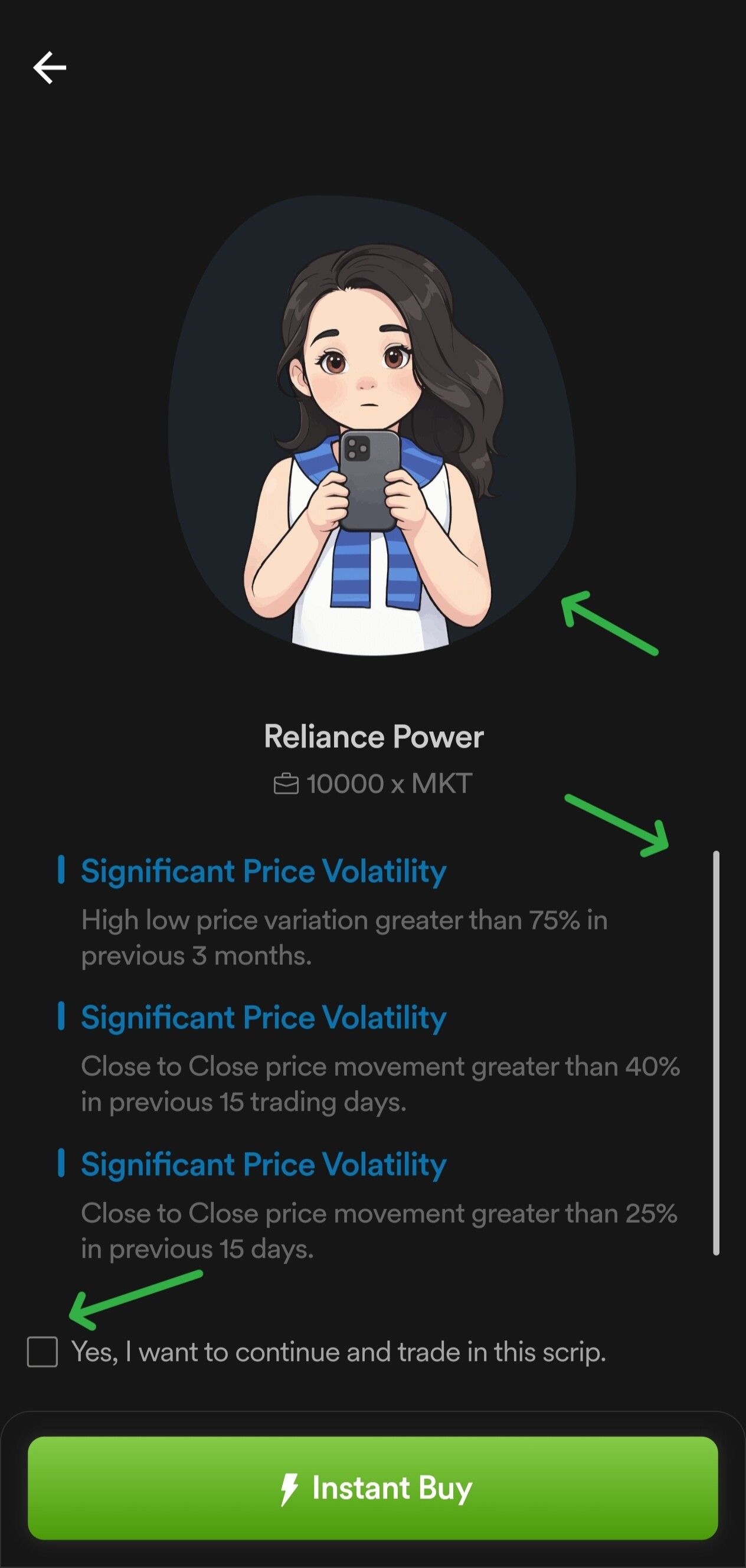
Right now, when I place an order, a nudge window pops up on the next page. Below that, there’s this tiny tick box, and the cartoon image above it takes up more than half the screen. Because of that, the important warnings end up in a scrollable area, which kind of defeats the purpose.
If the cartoon could be scaled down a bit and the tick box replaced with a bigger, more noticeable button, it would make everything a lot smoother and more user-friendly.
Attaching a screenshot to show exactly what I mean.