Hi,
would like to convey my concerns for closing mutual fund page.
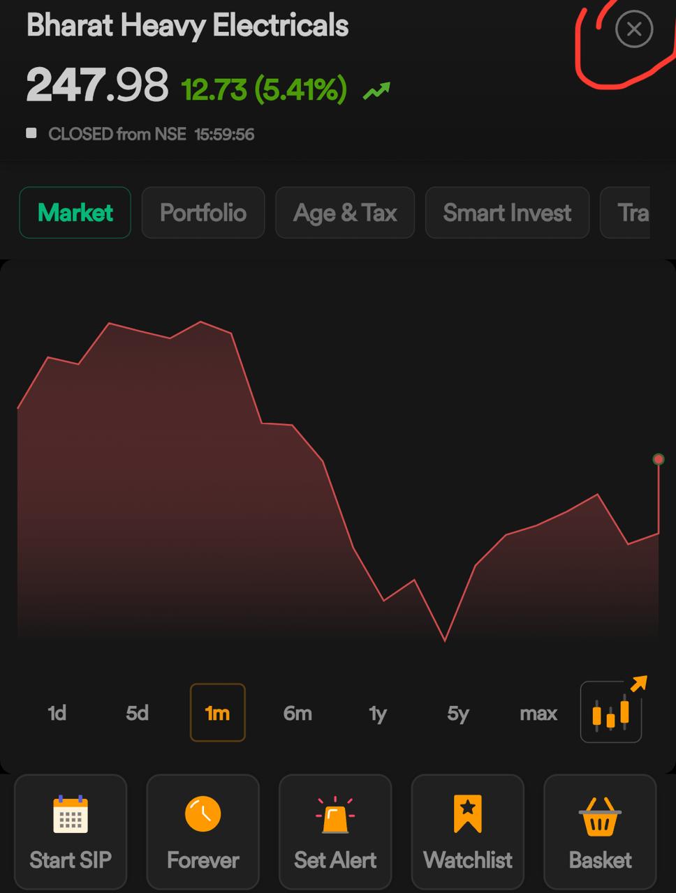
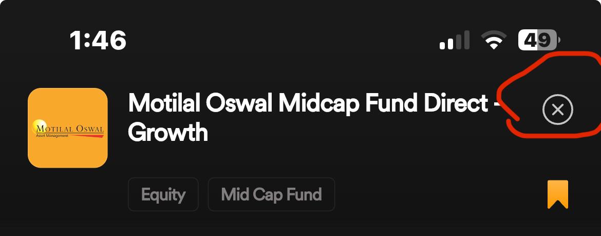
The close/bookmark button is so small and in so much close to corner that it does not work always.
Sometimes have to click 3-4 times then it works.
I would like to have this small button a bit bigger like Redeem or Invest More buttons.
Bigger button would be easier to click.
I don’t think issue is with button functionality but with location where it’s located or its not align properly.
Please check attached screenshots for reference.
Stock close button:
Mutual Fund close button:
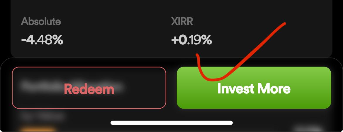
Good button example:
Thanks
Hi @Sudhanshu, apologies for the delayed response.
We tried replicating this at our end and this seems to be working smoothly at our end while closing the scrip/fund when clicked on closed button. Nonetheless, we have your feedback for an enhanced user experience.
Hi @Sudhanshu the close button works perfectly fine for me too.
Hi,
In my phone iPhone 14, close button location is very close to top right corner and icon is very small. It works but I guess 1 out of 10 it does not work and to click in corner location is a bit irritating.
It’s manageable but good to have big button considering there is lot of space available nearby by close button.
I would prefer Back button along with Buy and Sell for Stock and for mutual button along with Redeem and Invest more button.
This way it’ll be easier to use app with single hand.
To close current fund/stock we have to go to top corner.
I don’t know why UI designers don’t consider these types of common and useful cases.