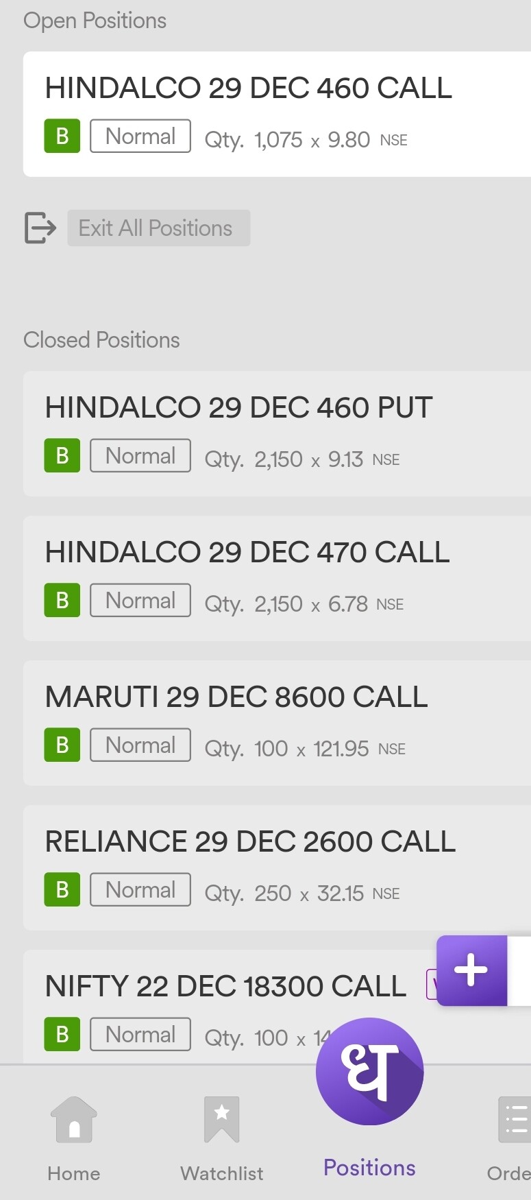
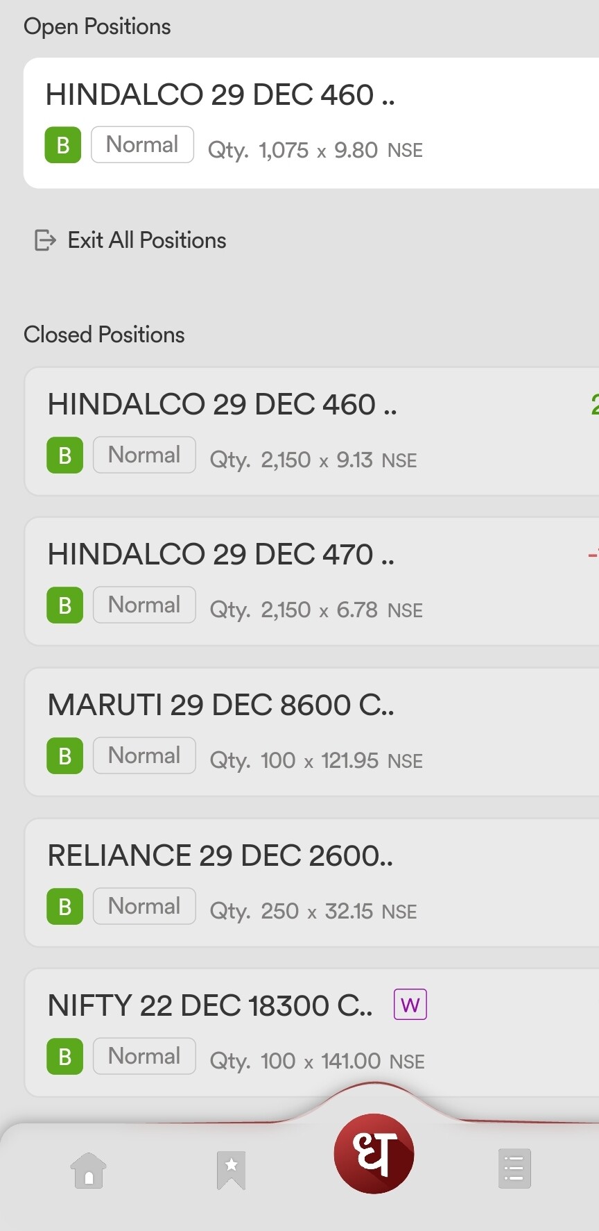
I hope the font size would be bigger. Second thing you’re using Roboto font. I suggest you to use a combo of ““Poppins & Montserrat””. Poppins should be used for Title and Montserrat for content. Instead of fixing many thing on single page, why won’t u create sections.
Well above suggestions are for both Web and App.
@PravinJ, Good to see you too and really happy that you still remember me.
Just expecting a bigger font size in next release including web. I hope this will be considered before releasing. See the elderly people should be able to see at least the heading. Even my father can’t see coz he has undergone Cataract Surgery few yrs back. I mean we’re fine with multiple sections rather seeing everything on single page.
You can create a vertical menu bar on left side (Web Version) and add all features into the bar. So if anybody need to open something, they can just click on the icon. For example - Portfolio, Order book, Reports, or Money Section etc. This will help to increase the size of font and may give a lot of space for other things which could help to improve a decent and simple UI/UX.