Hello Traders! ![]()
At Dhan, every feature we build for DEXT T3 starts with a problem we see power traders come across while trading or analysing the markets & data. And for traders who follow sector and stock rotation, this one comes up constantly - I knew the rotation was happening. I just saw it too late.
You had a view. You knew certain sectors were building strength. But by the time the move was clear enough on a price chart to act with conviction, the early part of the trade was already done. The rotation had rotated. You caught the tail end - or missed it entirely.
That’s not an analysis failure. It’s a visibility problem. And it’s exactly what the Relative Cycle Graph is built to solve.
Introducing: Relative Cycle Graph on DEXT T3.
The problem worth solving for every trader who tracks sectors or compares stocks knows this feeling.
You open chart after chart - one symbol, then the next, then the next. You’re trying to build a relative picture in your head. Which one is actually stronger than the benchmark right now? Which one is quietly building momentum while everything else is flat? Which one looked strong last week but is already starting to fade?
The problem was never your read on the market. The problem was that individual price charts were never designed to show relative rotation. It shows you where each symbol went. It doesn’t show you which ones are pulling ahead, which ones are falling behind, and which ones are quietly turning before price makes it obvious.
How the Relative Cycle Graph on DEXT T3 Solves It
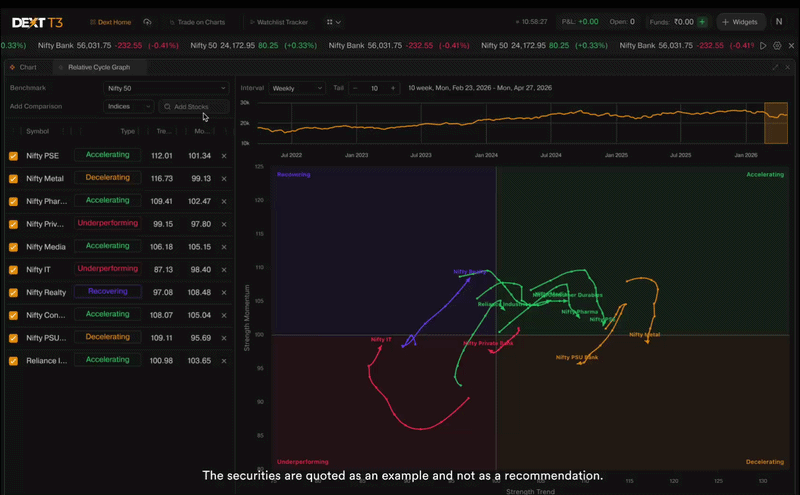
The RCG places every symbol you’re tracking on a single canvas — not as separate charts, but as a live map showing where each one stands relative to your benchmark and, critically, which direction it is heading.
The core idea: if the benchmark rises 5% and a scrip rises only 2%, that scrip is underperforming - even though it moved up in price. The RCG removes the market’s overall direction entirely and shows you only the relative story.
Two axes. One complete picture.
X-axis - Strength Trend: Is this symbol currently stronger or weaker than the benchmark on a sustained basis?
Y-axis - Strength Momentum: Is that relative strength accelerating or decelerating? This axis often turns before the trend does - giving you an earlier read than price charts alone.
The Four Quadrants - Your Rotation Roadmap
The canvas is divided into four zones. Where a symbol sits tells you its current rotation phase:
![]() Accelerating: Outperforming the benchmark and gaining further momentum. Highest relative conviction zone.
Accelerating: Outperforming the benchmark and gaining further momentum. Highest relative conviction zone.
![]() Decelerating: Still outperforming, but momentum is fading. Worth watching closely for a potential turn.
Decelerating: Still outperforming, but momentum is fading. Worth watching closely for a potential turn.
![]() Recovering: Underperforming the benchmark, but momentum is starting to build. Early-stage rotation candidate — often where the most interesting setups begin forming.
Recovering: Underperforming the benchmark, but momentum is starting to build. Early-stage rotation candidate — often where the most interesting setups begin forming.
![]() Underperforming: Weak against the benchmark and continuing to weaken. Lowest priority until clear reversal signals appear.
Underperforming: Weak against the benchmark and continuing to weaken. Lowest priority until clear reversal signals appear.
The classic rotation path moves clockwise — Recovering → Accelerating → Decelerating → Underperforming → and back. A symbol rotating from Recovering into Accelerating is a strong indication of building relative strength — worth watching closely before the price chart confirms it.
The Tail - Direction Matters More Than Position
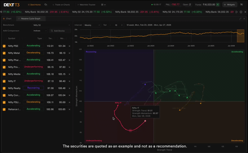
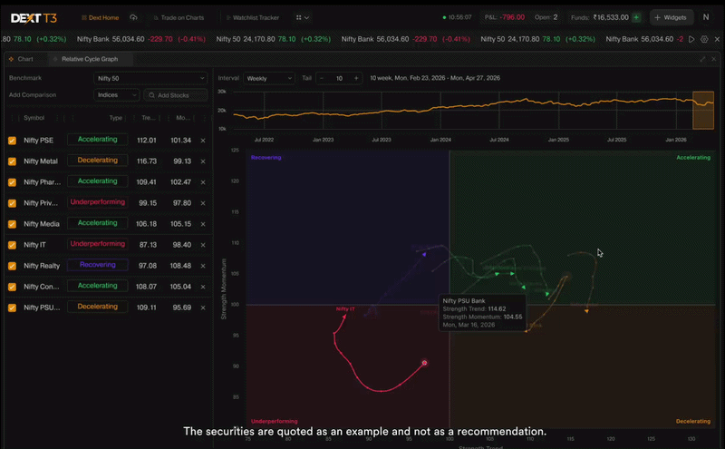
Each symbol leaves a visible trail of its recent positions on the chart. This is the tail.
The tail shows you where a symbol came from, how it’s rotating, and whether that rotation is building or stalling. A symbol sitting in Recovering means something very different if its tail is curving upward toward Accelerating versus pointing further into Underperforming.
Position alone isn’t the signal. Direction is.
What You Can See - Going Deeper
Alongside the main chart, the RCG on DEXT T3 gives you a structured view for every symbol you’re tracking:
→ Symbol Grid on DEXT T3 Every symbol plotted on the RCG also appears in a clean grid alongside it — showing its current quadrant, Strength Trend value, and Strength Momentum value in numbers. Scan the grid, spot the outliers, act with context.
→ Benchmark Strip Chart on DEXT T3 A mini chart of your chosen benchmark sits at the top of the widget — with a draggable window that controls exactly which period is used to compute the RCG tail. Zoom into a specific market phase. See how relative rotation looked during a specific move. All without leaving your workspace.
A Little Story of How We Built This
When we decided to build the Relative Cycle Graph for DEXT T3, the first decision we had to make was the most important one - how do we make this genuinely useful, and not just visually interesting?
Some implementations of this chart type use simple averages and fixed lookback periods - the same settings whether the market is calm or volatile. That creates a tool that works well in one regime and lags badly in another.
We made a different choice.
The RCG on DEXT T3 uses a Weighted Moving Average for Strength Trend - giving higher weight to recent data so the chart is more responsive to what’s happening now, without sacrificing smoothness.
And the lookback periods adapt automatically based on how volatile the symbol’s relative behaviour currently is. In high-volatility conditions, periods shorten — the chart reacts faster and reduces lag. In calm, trending conditions, periods lengthen — the chart stays smoother and reduces noise. You don’t configure this. The chart reads the current environment and adjusts.
The RCG on DEXT T3 lives inside the same terminal where you trade — powered by the same DEXT engine that executes your orders. You see the rotation. You act on it. All without leaving your workspace.
Built for Indian markets. Built for Indian traders. Built inside a terminal where analysis and execution are one.
Works for Sectors. Works for Stocks. Works for Any Benchmark.
The RCG on DEXT T3 isn’t limited to sector indices. You choose your benchmark, and you choose what you track — sector indices, individual stocks, or any combination. Adjust tail length and timeframe to match how you trade.
Weekly for swing and positional. Daily for shorter rotation plays.
How To Get Started with Relative Cycle Graph
- Open DEXT T3 - Download for Mac | Download for Windows | or use dext.dhan.co
- Add the Relative Cycle Graph widget to your DEXT T3 workspace
- Select your benchmark and the symbols you want to track
- Read the quadrant and tail direction for each symbol - and never approach relative analysis the same way again
See the rotation and act accordingly!
Try it out and tell us how you’re using it in the comments below. Every piece of feedback shapes what we build next on DEXT T3. ![]()
Happy Trading,
Bhavya